 GitHub
Card

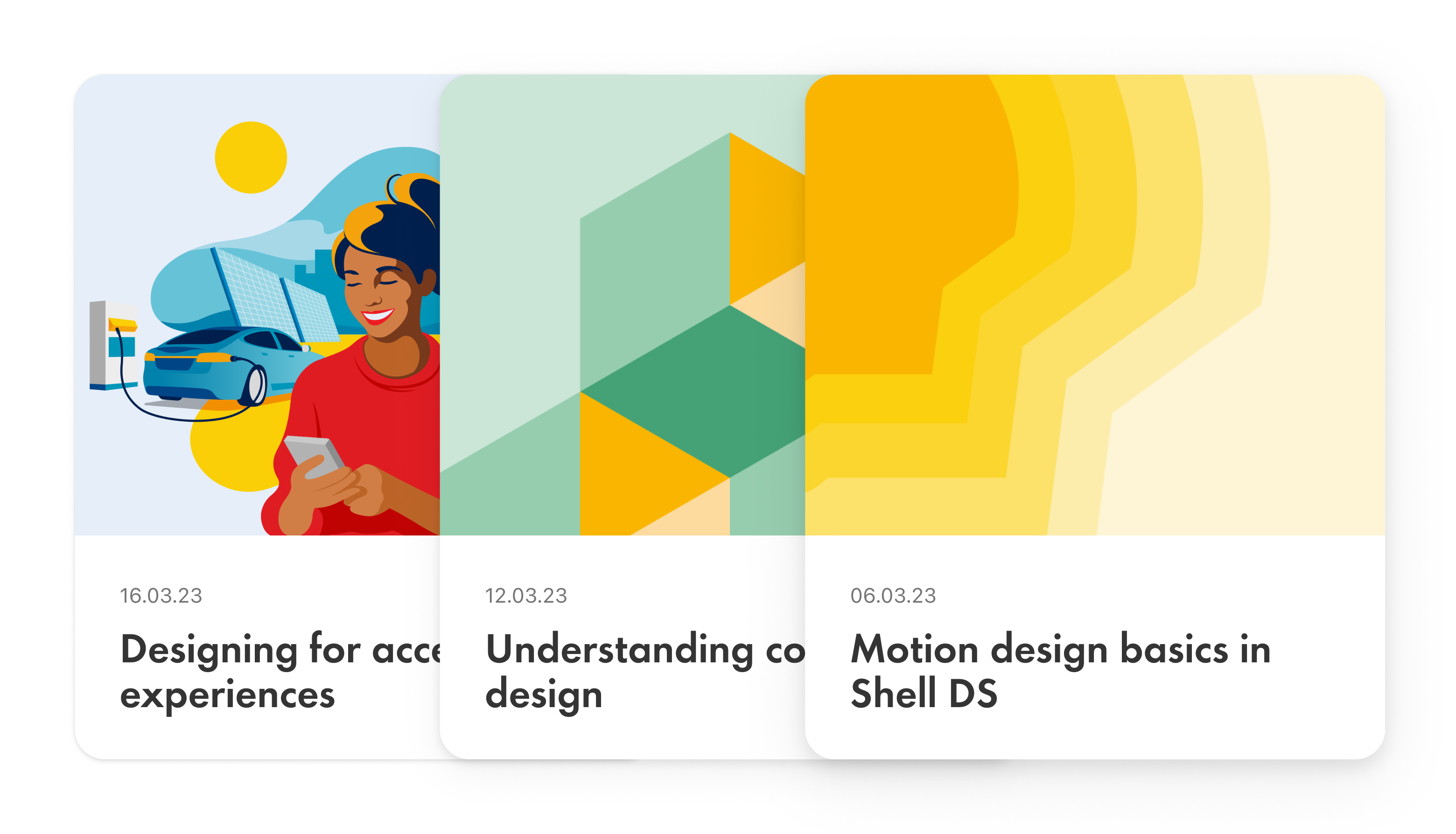
A card is a container that groups and displays content and elements. It can also be used as a link to navigate to other pages.
Examples
Usage
When to use
- To group and display content.
- As a link to navigate to other pages or content.
- To create a consistent and coherent look and feel.
When not to use
Don’t place a card inside another card without the use of a section.
Best practice
Responsive design
Ensure that cards scale correctly on all screen sizes and maintain their structure and legibility.

Clear visual hierarchy
Create a clear visual hierarchy using size and typography so that important information gets users' attention.

Consistent structure across a set
Place images, content and components consistently within the card to make it easier for users to scan and understand.
Options for interaction
Ensure that users understand that the card is interactive as a whole, or with specific interactive elements.

Container for sections
Cards are scalable and can be used as larger tiles and panels for page sections.

Accessibility
Shell DS components are programmatically determinable with appropriate semantic markup and are designed to meet colour contrast requirements. If you’re not using Shell DS code, you will need to cover the accessibility considerations for each component in this pattern.
Keyboard navigation
- Ensure that all interactive elements within the card are accessible through keyboard navigation.
- Use ‘Tab’ key for focus and taking action, ‘Space’ and ‘Enter’ keys to engage with buttons, icons and secondary elements.
Alternative text
Provide alternative text for non-text elements inside the card, for example, icons and images for screen reader users.
Code consideration
Use semantic HTML elements and attributes to ensure that cards are properly interpreted by assistive technologies.
Colour contrast
Ensure the colour contrast is 4:5:1 between text and background within the card, in accordance with WCAG guidelines.
Every effort has been made to ensure that the Shell Design System follows accessibility best practice.
The Shell DS React framework incorporates keyboard operation to support the widest variety of assistive technologies and devices. For any future frameworks other than React, accessibility will need to be reviewed.
Help us to help you by contacting the Accessibility team for support and information regarding any questions relating to accessibility.
Related
Is this page useful for you?
Your feedback helps to improve our documentation.